Designing for Pilots: What the Cockpit Taught Me About HMI
· 6 min read
Flying an aircraft and designing for one share more than you'd think. After earning my Private Pilot Licence, I've found the cockpit to be the most clarifying classroom in UX I've ever encountered.
Flying an aircraft and designing for one share more than you'd think. After earning my Private Pilot Licence, I've found the cockpit to be the most clarifying classroom in UX I've ever encountered.
The scan is everything
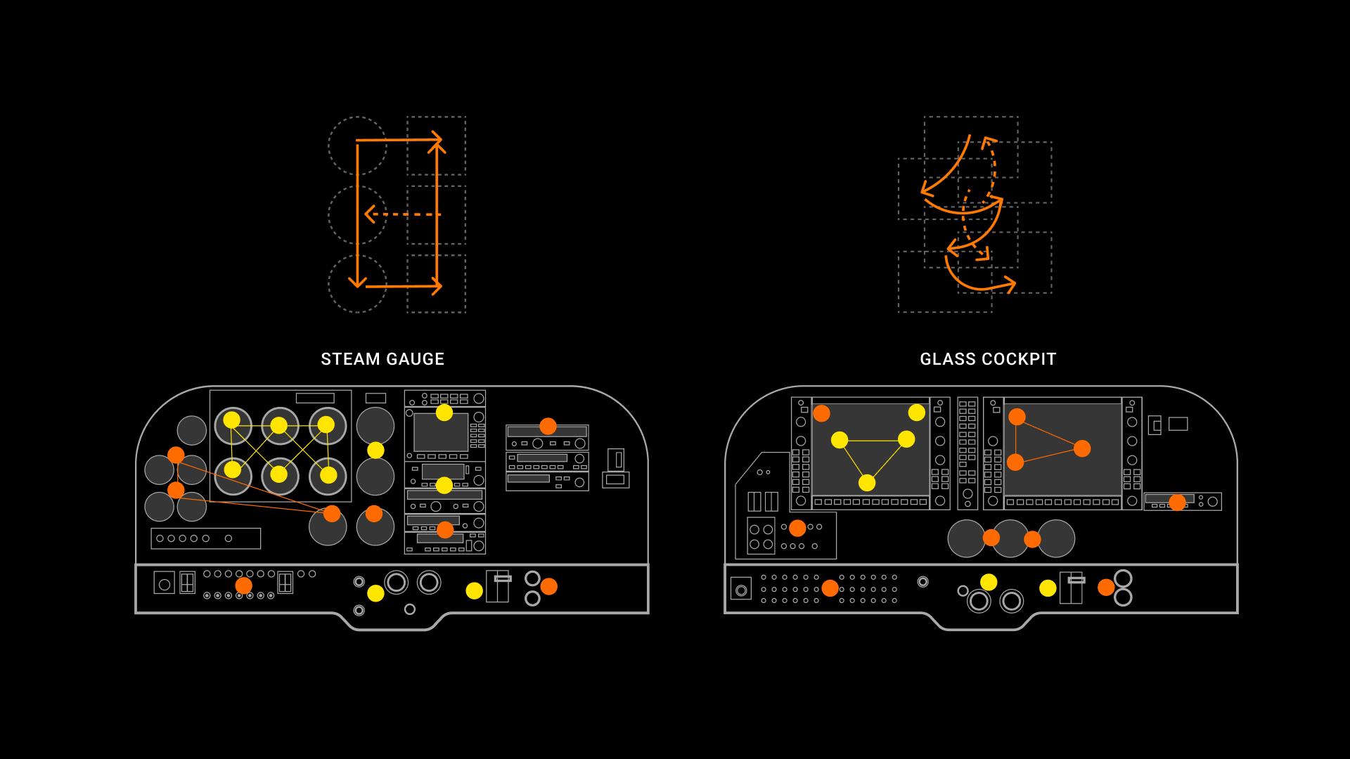
A pilot's relationship with their instruments isn't passive, it's a learned, rhythmic scan across a constellation of displays, each checked in sequence, each communicating a slice of the aircraft's total state. Break the scan, confuse the sequence, add visual noise, change a colour convention and you degrade a skill that took hundreds of hours to build. This is the central challenge of avionics HMI: you are designing for a cognitive routine, not just for legibility.
Colour carries legal weight
In aviation, colour is not aesthetic. Green means normal. Red means stop, warning, danger. Amber is caution. These conventions are codified in FAA and EASA standards, and a designer who overrides them for visual reasons is not just making a bad design decision, they're potentially creating a hazardous condition. Working within this system taught me to treat colour with a rigour I now apply everywhere.
Information density is a design decision, not a trade-off
The classic UX instinct is to reduce, simplify, remove, declutter. In avionics, this instinct must be balanced against a harder constraint: if information isn't on the screen, the pilot cannot act on it. A modern primary flight display shows altitude, airspeed, attitude, heading, vertical speed, and much more simultaneously. The design challenge isn't removing information; it's encoding it so clearly that it can be read in a single glance under workload. This reframes what 'simplicity' actually means.
Error states matter more than happy paths
Most digital product design is optimised for the happy path, the flow where everything works. Aviation design is optimized for the failure path. What does the interface show when an attitude indicator fails? When a GPS signal is lost? When two sensors disagree? Designing these states with the same care as the primary experience fundamentally changes how you approach interfaces outside of aviation too. Edge cases aren't edge cases; they're where the design actually gets tested.
The human in the loop is always the design problem
In UAVs we're designing interfaces for remotely piloted aircraft, systems where the pilot is physically separated from the aircraft they're operating. This amplifies every HMI challenge: the instrument scan has to work over a data link; the situational awareness has to be reconstructed from sensors rather than felt through the seat of the pants. And yet the cognitive principles are the same. The human needs to understand the system state, trust it enough to delegate, and recover it when the automation fails. That problem doesn't change whether you're in the cockpit or at a ground control station. The risk factor shifts, but additional challenges arise, such as the loss of visual cues and communication, whether Pilot-to-Pilot or Pilot-to-Ground (ATC).